This article was originally published on Nov. 3, 2016.
Our maps have been lying to us for centuries.
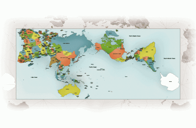
The standard classroom maps we all learned geography from are based on the Mercator projection, a 16th century rendering that preserved lines used for navigation while hideously distorting the true sizes of continents and oceans further from the equator. The result is a widespread misconception that Greenland is as big as Africa, Siberia and Canada are disproportionately massive, and that Antarctica apparently just goes on forever.
In reality though, Africa is larger than all of North America, and the Antarctic is about as big as Australia. That’s the difficulty with stretching a sphere to fit a rectangle, and for centuries cartographers have struggled to balance maintaining straight latitudinal lines with the preservation of perspective. But the AuthaGraph may be the pinnacle of accuracy.
Read more: 6 of the World’s Oldest Maps
Why is an Accurate World Map Hard to Come By?
For centuries, cartographers have made numerous attempts to account for the inconsistency while trying to recreate the most accurate map of the Earth. Maps are compromises between distorting the angles of latitude and longitude lines and the relative areas of the continents and oceans.
Some were made for specific purposes, while others just tried to find the cartographic sweet spot. The problem was so widespread that a French mathematician even developed an eponymous equation to quantify the degree of distortion that a world map experienced. Called Tissot’s indicatrix, the equation takes the form of circles placed at regular intervals across a map. By calculating how much each circle deforms, it is possible to determine how much the map is pulling and stretching the continents out of shape at that point.
Here are a few of the different ways cartographers have tried to depict the Earth.
Sinusoidal Projection
This map bowed out the equator in an attempt to replicate the topography of a sphere and avoid stretching out areas far from the equator. It succeeds in presenting a more accurate view of the poles, but at the cost of misshapen continents and bent meridians. Areas near both the equator and prime meridian are accurate, but the distortion gets worse the further you go from either.
Robinson Projection
This attempt at creating a faithful world map took a similar tack to the Sinusoidal by pulling out the edges of the map to mimic a sphere. The Robinson isn’t as extreme, however, taking the form of a much more gentle oval. The map was an attempt at a compromise between distorting the areas of continents and the angles of coordinate line. It was used by both Rand McNally and the National Geographic Society at one point.
Bonne Projection
A more outside-of-the-box example of mapmaking ingenuity, the Bonne Projection actually dates back to the 16th century. The heart shape preserves integrity near the center, but gets progressively more unrealistic as it moves outward. Keeping the focus on Europe and Africa means that most areas of interest to early cartographers were rendered nearly accurately, although Australia does suffer some unfortunate stretching.
Armadillo Projection
This map attempts a kind of 3-D simulation by projecting the map onto a torus. This keeps the continents in decent shape while causing the oceans to appear smaller, and cutting off half of Australia and all of New Zealand. As with other maps, the tops and sides suffer from the most distortion.
Read More: 6 of the World’s Oldest Maps
What Is the Most Accurate Map of the World?
We may finally have a faithful flat map, however. The 2016 winner of Japan’s prestigious Good Design, designers figured out how to translate our spherical world into a rectangular box. Hajime Narukawa, a Tokyo-based architect and artist, broke the globe up into 96 regions and folded it into a tetrahedron and then a pyramid before finally flattening it into a two-dimensional sheet.
The multi-step process preserves the true dimensions of the continents by angling them outward instead of stretching them, maintaining the illusion that they’re all laid out vertically like we’re used to. Their website states that the goal was to create a map better suited to address the problems of the 21st century, including rapidly diminishing sea ice and territorial claims of marine territory, by more accurately depicting what areas near the poles actually look like.
AuthaGraph
Called the AuthaGraph, the result is a world map that looks a little different than most of us are used to. Seen in rectangular form, Antarctica is intact and at the bottom right.
The Americas and Africa are tilted inward and pushed to the upper corners of the map, while Australia sits perfectly upright at the bottom center. The lines of latitude and longitude veer in odd directions, the result of transformations that broke them from their naturally spherical configuration.
Read More: The Mystery of Extraordinarily Accurate Medieval Maps
Finally, an Accurate Scale World Map
Most importantly, the continents are all rendered as they actually appear. Africa has regained its geographic primacy while North America and Europe are shrunk back to their true sizes. The oceans, too, are finally represented accurately. By breaking long standing rules governing how the continents and lines of latitude and longitude should appear, Narukawa has achieved a geographically accurate depiction of Earth.
His projection can even be tessellated to create a never-ending sequence of continents laid out next to each other. You can buy an origami version of his map composed of tiny segments separated by seams that folds from a globe to a sheet and back again.
Narukawa says that his map is not quite accurate yet — some regions are slightly distorted. He hopes to perform even more subdivisions of his globe to achieve true representations of the continents and ensure the most accurate map of the world.
Read More: Earth Actually Has Four North Poles


