Mark Changizi is an evolutionary neurobiologist and director of human cognition at 2AI Labs. He is the author of
The Brain from 25000 Feet, The Vision Revolution, and his newest book, Harnessed: How Language and Music Mimicked Nature and Transformed Ape to Man.
The human fascination with color never ceases to amaze me. Our perceptual experience is filled with shapes and pitches and textures and timbres and depths and on and on, yet color seems to get the lion share of our excitement and philosophical attention. Color seems somehow more artistic than our other perceptual dimensions; it’s simply wonderful to behold, as evinced by the double rainbow guy; and we can’t resist wondering what it would be like to see dimensions of color beyond our own. In fact, RadioLab recently put out a great show on color that nicely conveys the romance we all have toward it.
Question is: Why do we find color so enthralling? One of the reasons may be that the world can seem arbitrarily labeled in color, as if a painter dabbed over everything in order to make it beautiful... and that naturally makes us wonder what a different artist might do. What sort of splendor is a bird---who has an extra dimension of color beyond ours---treated to, for example? While I, too, feel the wonder of color, I don’t share this above intuition about color and its arbitrariness. It’s an unfortunate intuition, one that seeps its way not only into the minds of laymen, but into our “enhancement” products and even the hallowed halls of philosophy. In trying to explain what’s wrong with the intuition, let me begin with a thought experiment concerning a product that gives the wearer “shape enhancement” vision.
“With our sunglasses’ shape-enhancement filter, you’ll see the world with more vibrant and interesting shapes. Round things will be rounder, regular polygons more muted…”
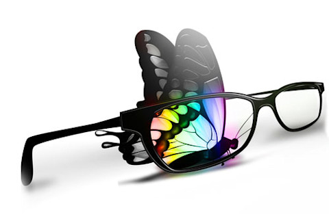
That would be a peculiar marketing pitch for a pair of shades---bragging that it lets you see shapes that aren’t really there! It reminds me of a pair of glasses we somehow acquired at 2AI Labs that places little stars everywhere within the visual environment: it’s a novelty toy to give out at events, not serious eyewear. “Shape-enhancing” eyewear, were it to exist, would also be a novelty toy, perhaps used for fun-house-style entertainment. But few of us would be interested in using them for everyday wear. We want to see the world roughly as it is, not geometrically warped for no reason. Yet, as absurd as shape-enhancing eyewear is, there is an analogous sort of enhancement that companies regularly tout: color-enhancement.
“With our sunglasses’ color-enhancement filter, you’ll see the world with more vibrant and interesting colors. Green things will be greener, violets more muted…”
This doesn’t initially sound nearly as silly as shape-enhancement, but, when you stop and think about it, the marketing pitch is bragging that the eyewear lets you see colors that aren’t really there! Why should it be acceptable to warp colors but not shapes? I’ll suggest here that it’s not acceptable---that once we appreciate the meaning of color it becomes apparent that we shouldn’t arbitrarily engage in color distortion. The significance of the shapes of things within our visual field is fairly obvious. Shapes tell us about the true three-dimensional arrangement of the scene in front of us. Shapes tell us how our view will change were we to move. Shapes tell us what we’d hit were we to throw a rock in any given direction. Shapes give us hints as to the rigidity of objects, and sometimes even to what it would feel like if touched or lifted. Mess with the shapes of the things in your visual field, and there is a consequent deluge of changes in what it means for us. The significance of the colors of things, on the other hand, is much less obvious, and so scientists and philosophers have long wondered whether inverting or otherwise warping or messing with the spectrum might not really matter. These are the “inverted spectra” thought experiments. Maybe green to you is red to me, but the difference leads to no other cognitive or behavioral differences. If colors are arbitrary labels placed over the world, then inversions and warps shouldn’t matter. Whereas people happily imagine inverted color spectra in thought experiments, they’re not happy to do so for
most other classes of stimuli. It’s not plausible, for example, that low pitch for you is high pitch for me, that pitches for you sound like loudnesses for me, or that circles for you look like squares for me. Inversions in these cases sound ridiculous because it is more obvious that these other perceptual dimensions are intricately linked to hosts of other aspects of our mind, and inverting them would scramble those connections. There are cross-modal associations tying pitch to real-world meanings, namely (as I argue in my book, Harnessed) to the Doppler shift, and the speed and direction of a mover in one’s midst. Pitch and loudness can’t be swapped because one concerns velocity and the other distance. And shapes can’t be “inverted”---squaring circles and vice versa---because they mean fundamentally different things: about the identity of objects, about how their shape will vary as you move around them, and so on. It may not initially seem quite so silly to invert or otherwise mess with colors, but, far from arbitrary labels, colors are just as steeped in meaning as are shapes, pitches, and all the other non-invertible dimensions of our experience. I’ve argued in my research and in my book The Vision Revolution that our primate-variety color vision is optimized for sensing the spectral signals on skin
when we blush, flush, blanch and signal other emotions. Our peculiar variety of color vision is just the needed peculiarity to sense oxygenation and concentration modulations in the blood under the skin, the physiological dimensions undergirding the colors we signal. Red is ultimately tied to oxygenated blood, and therefore connected to the emotions, moods and other states indicated by showing oxygenated blood. Red is swarming with associations to other facets of our mental space: red is strong, sexy, loud, high-pitched and so on. Green, on the other hand, has its own set of associations, quite different from red’s: green is weak, wan, envious et cetera. What it’s like to experience red relies on its associations. If green were to have all red’s associations, it would seem very un-green indeed. Colors can’t be inverted any more than the other dimensions of perceptual experience. Therefore, colors shouldn’t be mucked with. Not in philosophical thought experiments. And not via “color-enhancement” for everyday eyewear, like in sunglasses. After all, that’s what color-enhancement often does: Having been designed without an appreciation for the meanings found within our color experience, color-enhancement has been much like “enhancing” music by blindly fiddling with the mixer knobs. (With an appreciation for the meanings of color, however, we at 2AI Labs have endeavored to truly enhance color perception, rather than blindly fiddle -- but that's a story for another time.) If the thrill of color were entirely due to the mistaken intuition that colors are arbitrarily splashed onto the world, then, with that intuition dispelled (as I've tried to do) color’s beauty would dissipate. But I don’t believe that the fundamental appeal of color is due to this arbitrary-splashes basis at all. Instead, it seems more likely that our love of color comes from the meaning of color, namely, that color vision for us primates is a deeply human and emotional sense. Color is evocative and aesthetic because its subject-matter concerns the most evocative states of the most important objects in our lives: other people. That’s why we find color so captivating. It’s not because color floats above the world ungrounded, but, rather, because it is so deeply rooted in our psyche. Image copyright Zffoto/Shutterstock


